Fight in the museum: 9 Questions with artist Adriana Groza
I had the privilege to be interviewed by established and renowned artist Thomas Kelly for the October edition of the Hamilton Post’s “Fight in the museum” Arts column. I answer a series of recurring questions, starting with sources of inspiration, and ending with vision and aspirations for the future.
Interview Highlights
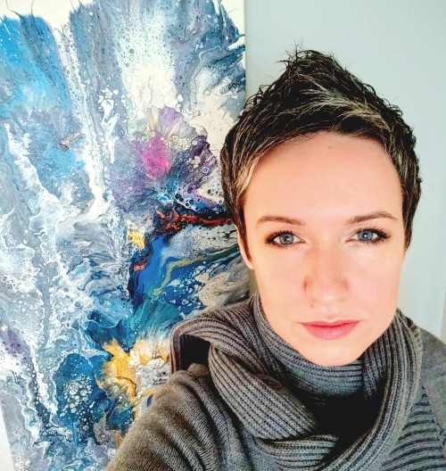
Adriana Groza is a Hamilton painter originally from Romania in Eastern Europe. Her work is done in fluid acrylics.
Liquid paint used on a flat horizontal canvas and manipulated to form beautiful abstract shapes, patterns and diffusions. The biomorphic shapes both show movement and tranquility, sometimes within the same painting.
What are you communicating with your art?
I like to think that my audience gets a message of positivity, energy and hope when looking at my artworks. It is a way of perceiving or understanding time; whether it is the perspective while looking at a beach and I am grounded in a space that has been there for millennia, or being mindful of the single wave in front of me. Maybe contemplating the seasons of life when painting perennial flowers.
My art is also about letting go of control and perfection, and just being in the moment.
What media do you use and how did you get started with it? Tell us about your process.
I use professional grade Fluid acrylics (I have created, over time, my own proprietary formula) which I apply on deep edge gallery wrapped canvas and manipulate in various ways, with a diverse set of tools, never a brush. I am dedicated for now exclusively to this medium and style of painting.
[…]
I find it a great match with my personality. The paints flow with ease and minimal restrictions or coercion, yet the preparation process is lengthy and complex. I enjoy working hard to prepare and then have the art unfold quite fast before me.
Are you drawn to certain colors?
The color that I have always connected with is orange. It is the color of warmth and abundance of good energy, excitement, as well as intense and explosive beauty in nature. A special and close second place goes to blues, from aqua to royal blue, and they translate for me into calm, trust and reliability.
Blue is a grounding color that is present in most of my art.

“Eternity and a Moment”, 2021


